CASE STUDY - Hatchlands School

Exploring a Case Study on Hatchlands School. How Students Transform Values into Real life Characters


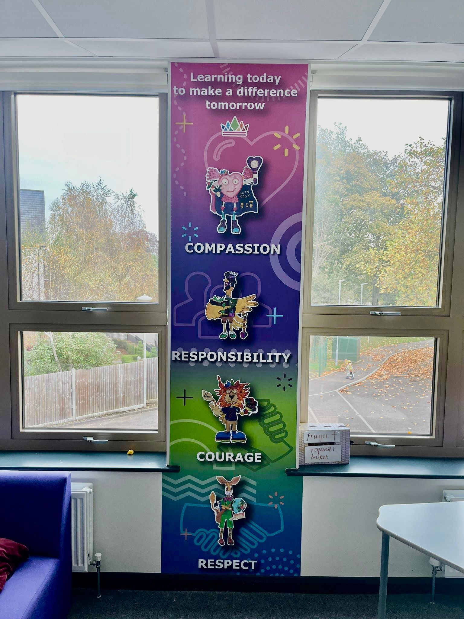
At Hatchlands School, they wanted to highlight their principles in a way that would involve the students actively in the project development process. What did they come up with as a solution to this challenge? A customised wall art initiative showcasing characters created by the students themselves. These characters symbolise the school's core values of Empathy, Duty, Bravery and Esteem and serve as the centrepiece of an uplifting display throughout locations within the school campus. 


Hatchlands School faced the challenge of establishing a setting that mirrored their dedication to nurturing character growth and engaging students actively, aiming to; 

  • Showcase their beliefs in a manner that would connect with students and employees alike. 
  • Let's involve students in the design process, making them feel ownership and incorporating their creativity into the mix. 
  • Use captivating visuals to embed these principles as a meaningful element of the school's essence. 


Collaborating closely with Hatchlands Schools students kicked off the design journey by letting the students embody each value through a character they created and visualised themselves. These original characters were later transformed into form by professionals and blended into a unified design for installation in various spots around the school. 

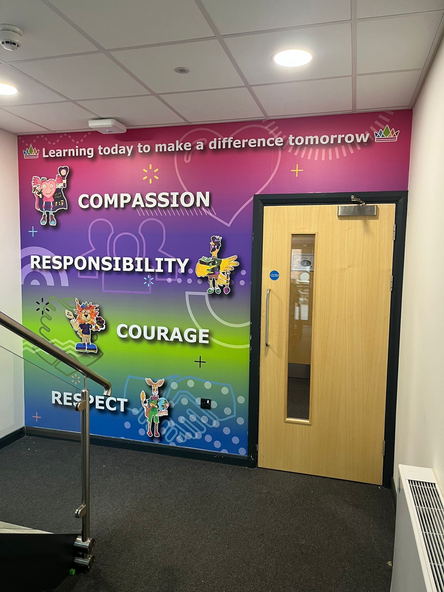
Characters taking action; 

  • Each symbol conveys a symbolic representation of a value upheld by the school.
  • Compassionate individuals exhibit nurturing and empathetic qualities while assisting others in need. 
  • Leading by example, a dedicated and considerate individual demonstrates responsibility effectively. 
  • Courage is being bold and brave, prepared to face and overcome challenges, and determined and strong character. 
  • Respect is displayed by someone friendly and cooperative, promoting the idea of inclusivity. 


Strategic Positioning; 

  • The vibrant wall near the staircase prominently displays the values students can see as they navigate the school each day. 
  • In the assembly hall, a displayed banner serves as a reminder of these principles during gatherings and events. 
  • A tall exhibit offers another eye-catching symbol of the school's values and beliefs in a shared space. 


Design Specifics; 

  • The bright gradient background enhances the dynamic and uplifting aesthetic. 
  • The statement "Learning how to create an impact in the future" connects the individuals to the school's mission. 
  • The student characters are depicted in a manner that ensures a blend of excellence and genuine authenticity. 


The Influence; 

  • The project encouraged students to feel pride and ownership by incorporating their designs into the learning process. 
  • Interacting with the values portrayed by the characters offers students a relatable method for more vividly and, lastly, understanding the school's principles. 
  • The school's key areas have been uplifted with inspiring graphics, creating a vibrant and enriched environment. 


Hatchlands Schools project highlights their dedication to promoting a culture based on collaboration and shared values within the community. 

In summary, the colourful wall designs at Hatchlands School showcase how creativity and student engagement can uplift the school's atmosphere and identity effectively. Transforming core values into characters does not honour the school's beliefs. It also offers an interactive avenue for students to embody these principles daily. This effort has established a meaningful heritage to motivate both upcoming students. 

By angel April 17, 2026
You’ve seen it before. A beautiful, vibrant wall display that looked incredible on the day it was installed. Fast forward six months, and the edges are starting to curl. A year later, it’s peeling away at the corners, or the vibrant blues and reds have started to look a little tired and faded. In a busy school environment, "good enough" usually isn't. When you are looking to transform your school corridors, reception areas, or classrooms, it is easy to focus entirely on the design. After all, the design is what tells your story. It’s what inspires your pupils and impresses your visitors. But the material those designs are printed on? That is what determines whether your investment lasts for a decade or ends up in the bin before the next OFSTED inspection. At Cubed Creative , we’ve spent 21 years working inside schools. We know that a corridor isn't just a walkway; it’s a high-traffic zone where hundreds of blazers, backpacks, and wandering hands pass by every single hour. Choosing the right school wall graphics materials is the difference between a long-term asset and a short-term headache. The Science of the "Shrink": Monomeric vs. Polymeric Vinyl If you’ve been gathering quotes for school wall graphics , you might have noticed a significant range in pricing. Often, the "cheaper" quotes are using what we call Monomeric vinyl. To keep it simple: vinyl is made of plasticisers. In monomeric vinyl, these molecules are short and "unbound." Over time, especially when subjected to the fluctuating temperatures of a school building, these molecules migrate. The result? The vinyl literally shrinks. When vinyl shrinks on a wall, it pulls away from the edges. It leaves a sticky, unsightly residue that attracts dust and dirt. It looks poor, and more importantly, it becomes a target for inquisitive fingers to pick at. This is why we champion polymeric vinyl school graphics  Polymeric vinyl is engineered with longer molecular chains. It is far more stable. It doesn't shrink, it doesn't curl, and it stays exactly where we put it. It’s the gold standard for long-lasting school wall displays . When we talk about durability, we aren't just talking about the print staying bright; we’re talking about the material staying bonded to the wall.
By Gary Boad April 6, 2026
The morning rush. You know the one. It is a whirlwind of lost shoes, half-eaten toast, and the ticking clock. Then comes the final hurdle: the school gate.
By angel March 20, 2026
We’ve all been there. It’s 4:00 PM on a Tuesday, you’re armed with a staple gun that’s seen better days, and you’re staring at a vast expanse of blue sugar paper that refuses to stay flat. You want your classroom to be an inspiring hub of learning, but by the time the final border is pinned, it looks more like a chaotic explosion in a stationery shop. At Cubed Creative, we’ve spent the last 21 years helping schools transform their environments. We’ve seen the good, the bad, and the "why is that poster from 1994 still there?" The truth is, your walls are more than just partitions between rooms. They are silent teachers. When used correctly, school wall graphics can boost engagement and reinforce key concepts. When used poorly, they become a distracting mess that hinders focus. Here are the seven most common mistakes schools make with classroom wall displays, and, more importantly, how you can fix them. 1. The "Everything but the Kitchen Sink" Approach There is a common misconception that a "good" classroom is a covered classroom. We feel the urge to fill every square inch of brickwork with posters, bunting, and student work.  The Mistake: Visual overload. Research suggests that heavily decorated classrooms can actually decrease student performance. When every wall is screaming for attention, the brain struggles to filter out the noise. This leads to cognitive overload, particularly for pupils with SEND or sensory processing sensitivities. The Fix: Aim for the 20% rule. Keep at least 20% of your wall space clear. This "white space" gives the eyes a place to rest and allows the important displays to actually stand out. Think quality, not quantity.
By angel March 2, 2026
An Open Evening is not just an event on the calendar. It is a defining moment. Before the results are discussed. Before the curriculum is explained. Before questions are asked. Families are already forming an opinion. And your environment is leading that conversation. The Challenge: You Only Get One First Impression When parents walk through your doors, they are looking for reassurance. Is this school calm? Is it ambitious? Does it feel purposeful? Will my child belong here? A blank wall is a mystery. An inconsistent board confuses. A wall that has not changed for months or years is an indicator that communication with the wall is not important. But clear, intentional design builds confidence immediately. Your space either reinforces your message — or distracts from it.
By Gary Boad February 21, 2026
Step into any hallway at school. Something sits there before any text shows up at all. Quiet. A spark of drive. Heat in your steps. Yet at times, everything feels too heavy to carry A flash of colour stirs something deep, almost right away. Inside classrooms, that instinctual reaction holds weight - greater than many allow themselves to see. What keeps people okay isn't only rules or school counsellors. It shows up in each part of the daily world that kids navigate.
By angel February 13, 2026
A school hallway might hold paintings, award posters, and a time chart. Imagine stepping inside a quiet hallway. What happens if young learners find themselves wandering past moments from long ago? Every day, history timeline walls quietly spark interest. They transform ordinary rooms into moments where people pause, talk, and wonder. Curiosity grows without fanfare. Culture comes alive through simple displays. Conversations start where none were expected.
By angel February 7, 2026
Before a single word is spoken, a school has already started talking. From the moment someone steps through the doors, the environment sends signals. Calm or cluttered. Confident or uncertain. Purposeful or forgotten. These first impressions shape how visitors feel — and how much trust they place in the school.
By angel January 31, 2026
Giving pupils a visible voice in their school What kids think shows up on those walls - transparent, seen, shared. Their thoughts take shape in ways others can notice. This place proves voices count, without saying it outright. Not tucked away. Right there on the walls.
More Posts

Back to home